Balance part 1
A pleasing composition reflects three key principles-
unity, balance, and movement.
Our experience in the physical world naturally gives us a sense of balance, making our ability to create balanced designs intuitive. We know that big things usually weigh more than small things. Everyone has balanced on a teeter-totter absorbing the knowledge that a small child must sit far out at the end to balance an adult positioned near the center.
In a design, balance is determined by the visual weight and position of the components. In an out-of-balance composition, the viewer's eye is drawn to the heavier side. Balanced doesn't mean static. A well-balanced composition moves the eye around and throughout the design. Remember, the trilogy requires balance, unity, and movement.
Studying these concepts and putting our physical experience into words gives you the tools to transfer intuition to your conscious awareness so you can deliberately find or create balance in your designs.
To evaluate balance in a composition, it can help to divide the design into quadrants along the horizontal and vertical axes. Comparing the quadrants lets you see the visual balance between unlike components.
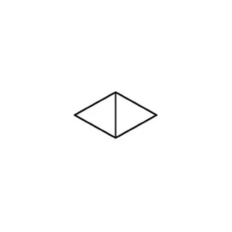
Units can be arranged symmetrically or asymmetrically
across a horizontal, vertical, or radial axis.

Judith Kinghorn
Twig and Leaf Necklace
This necklace is nearly symmetrical, with each side of the vertical center almost mirroring the other using similar leaf shapes, sizes, and positions. She adds interest by gesturing the leaves in differing directions.
There are four general categories.
Formal Symmetry:
components are mirrored on each side of the horizontal or vertical axesRelaxed Symmetry:
less similar components are evenly distributed on each side of an axisAsymmetry:
components of dissimilar weight and characteristics are arranged within the composition.Radial:
components are arranged along axes radiating from a point
We naturally grasp a simple equation such as large shapes weigh more than small shapes. However, in design, a shape will also have a color and texture and be placed in front of or behind another component, with each factor influencing its visual weight.
A design component is composed of many elements, each contributing to its effect. For example, a line can have texture and color and be smooth or jagged. As we'll see in the following examples, each of the elements of design can be used to facilitate the balancing of a composition.

Judith Kinghorn
Learn about radial balance from Judith Kinghorn’s masterful flower brooches, especially how to maintain interest.
Radial balance can easily become static. Here, she adds movement by tilting the stamen mound upward.

Judith Kinghorn
Opal Spiderweb Pin
An example of relaxed symmetry with components arranged along a central axis. The intense color of the boulder opal weighs more than the larger matte gold shape on the right. Strong color equalizes a larger shape of a subdued hue. The texture of the gold component moves the eye away from the gravitational pull of the opal.

These three pendants by Elaine Rader are a lesson in relaxed symmetry that incorporates aspects of asymmetry to create interest and movement. Components are balanced along a central vertical axis with variations in line, scale, texture, color, and position. Pay attention to your eye movement as you study each one. Note and name the components that catch your attention.
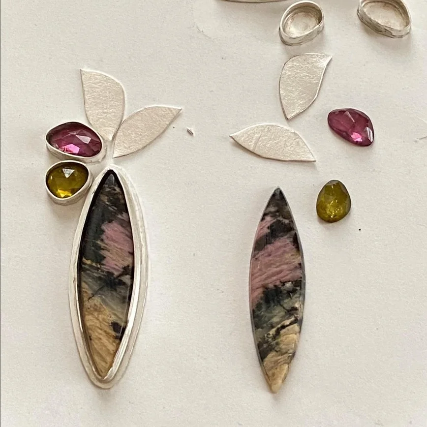
Elaine Rader
This image from Rader's Instagram page gives insight into how she arranges components to achieve balance with interest.

Magic Forest Brooch
Isabell Kellner frequently uses radial symmetry in her brooch designs. Here, she positions the tiny components away from the large central element to balance both the dark color and the size differential.
The variety of sizes in the outer elements moves the eye.

Isabell Kellner
Magic Forest Brooch series
An example of asymmetrical balance. Kellner pairs the smooth, large silver shape with a cluster of small, colorful elements.
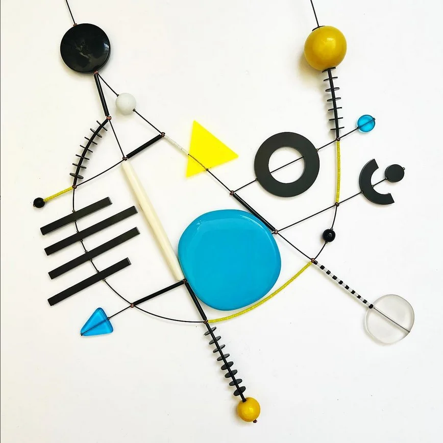
Lora Nikolova
Nikolova creates excitement with bold asymmetry using very different elements scattered across the composition.
Next week, see how the visual weight of elements change according to their characteristics.
And how movement works to keep a balanced design interesting.